Complex fade animations with Swiper
Recently I was presented with an interesting challenge in my day to day job and wanted to share the result and the process of how I solved that challenge. So this is just that, an article about how to implement a rather complex fade animation using the slider library Swiper. The animation itself uses the progress property on the Swiper instance to determine the opacity on each slide as you swipe between slides. Anyway, let's dig right into it!
All the code and a markdown version of the article is available on Github, and you can find it here.
Basic layout
We start off with a basic slider where the slides take up 100% of the width of the container, and the slides do not loop. Meaning we can only swipe from start to end. Here's a screenshot of the layout:
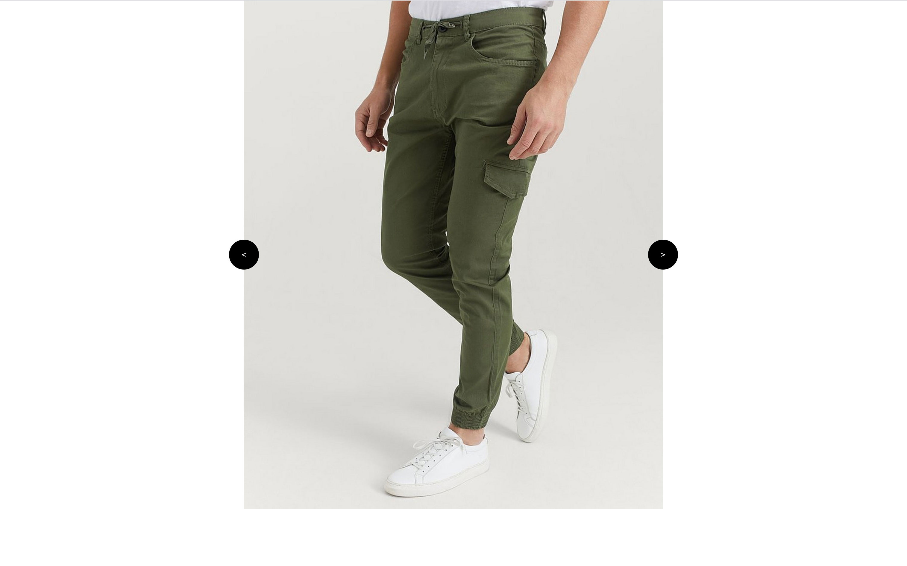
Init
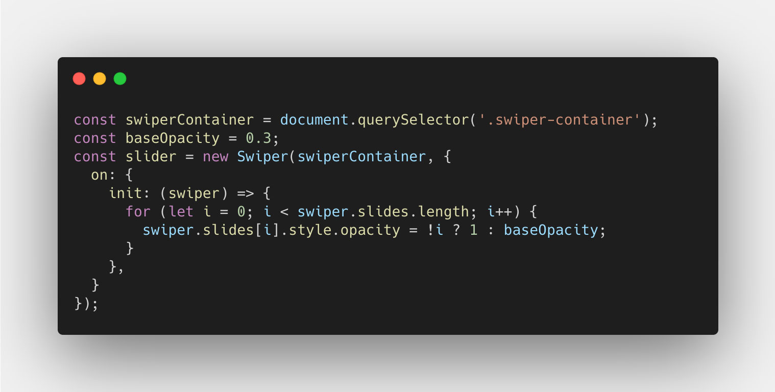
With the basic layout, we can start by using the event handler on that the Swiper API exposes, and then create the first event listener for `init` that is emitted when the Swiper instance is initialized. At this point, we want to set the opacity of the slides to either, the base opacity (which I set to 0.3) if it's any of the slides that is not the first slide, or 1 if it's the first slide. We do this using a basic for loop, like so:
Transitions
Then we can start looking at how we can transition between the slides using the navigation buttons, that is the next and previous buttons. These will trigger a couple of events on the Swiper instance, two of which we will use: transitionStart and transitionEnd.
On transitionStart, we want to determine the slides opacity, like we did on the init event, but this time we want them to transition between their current opacity value, and the new value. We can do this using a basic CSS class, and apply it to our Swiper container. The CSS will look something like this:

For the JavaScript code, we can use a property called activeIndex to determine which slide index is now active since the transition started. That will be the slide that should now get the opacity value of 1, while the others get an opacity value of 0.3 (base value). And the JavaScript code will look something like this:
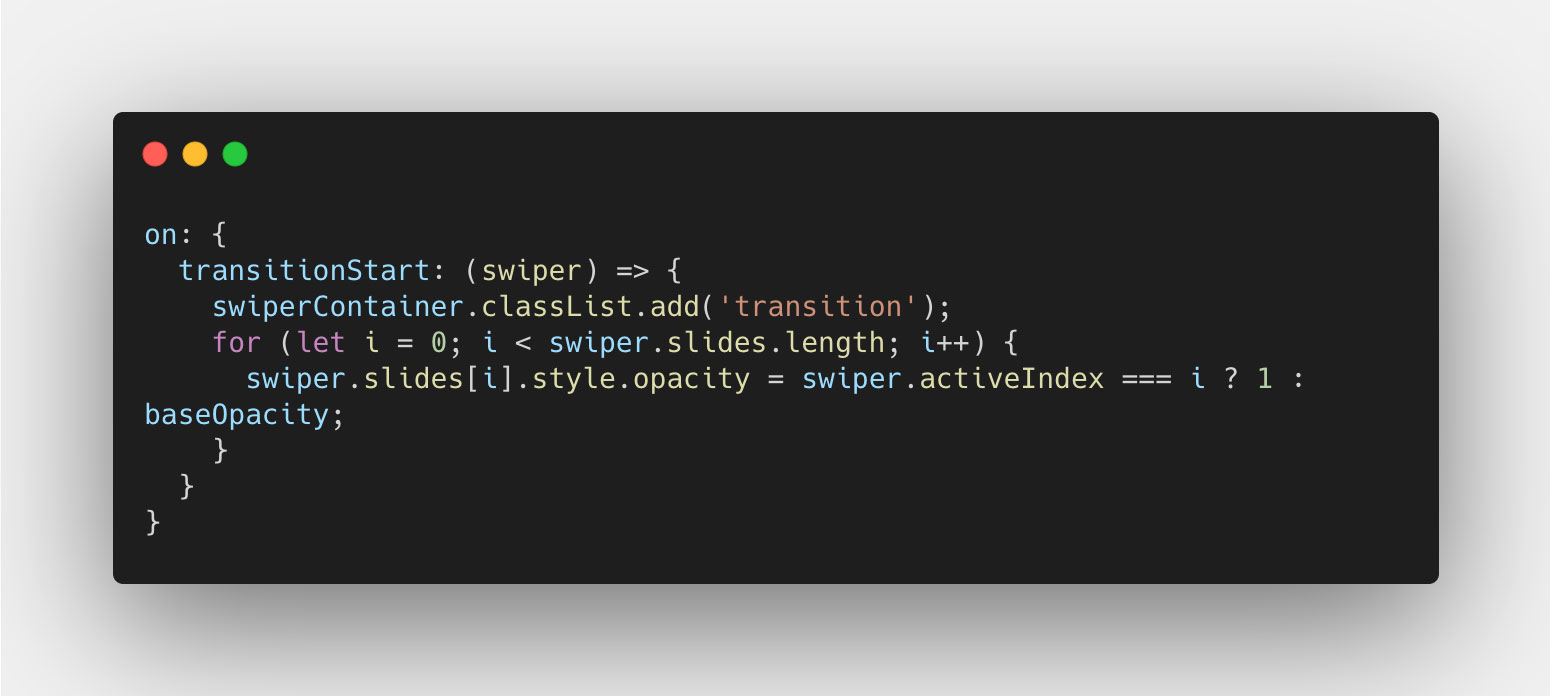
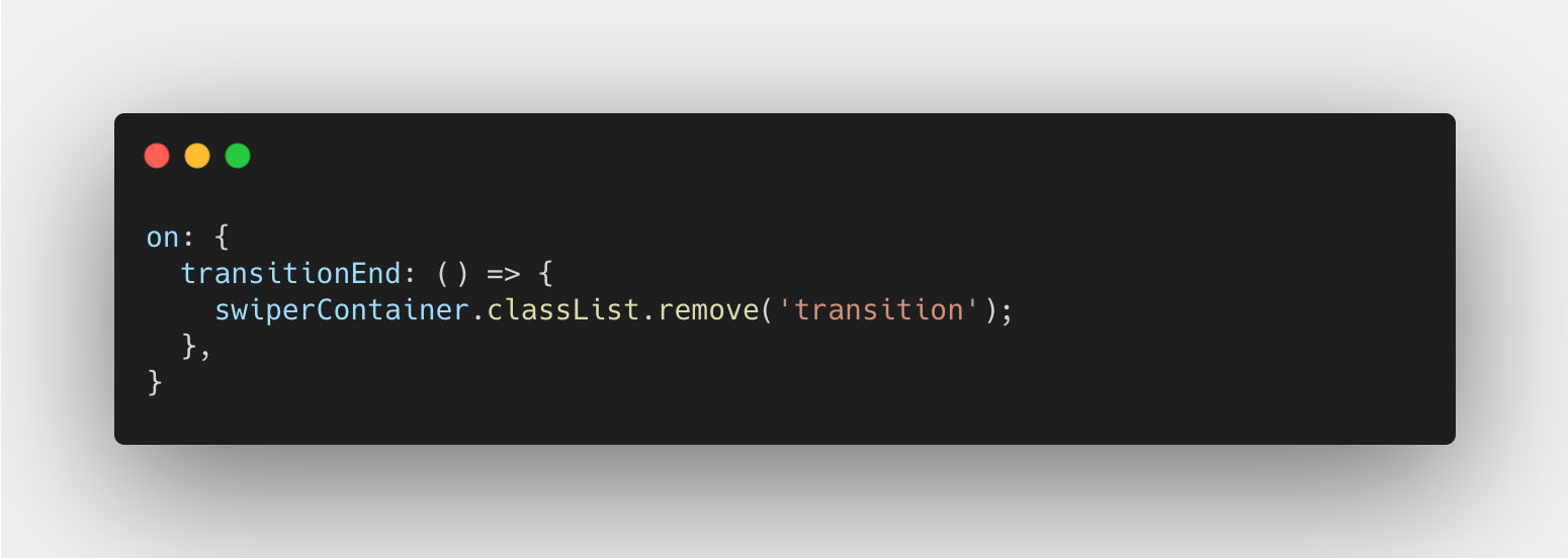
And now for the transitionEnd, we really only have to turn off the transition of the slides, since the transition is now over. And we do this simply by removing the class from the Swiper container DOM node. Like so:
Progress
Now you should have a pretty neat fade animation between each slide as you navigate back and forth using the previous and next buttons. However that transition is not yet bound to the touch, or swipe, interaction that you see on touch devices (and also works with the mouse).
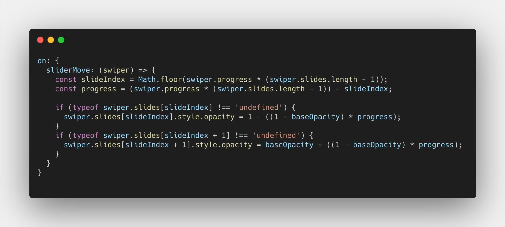
To get this working, we'll use a property called progress on the Swiper instance, and an event called sliderMove. The event is triggered whenever the Swiper instance is moved in any direction, pixel by pixel. And the progress property gives us a percentage of how "far" the slider has moved, from start to finish. This gives us the ability to change the opacity value of each slide, using the progress property, whenever the sliderMove event is emitted.
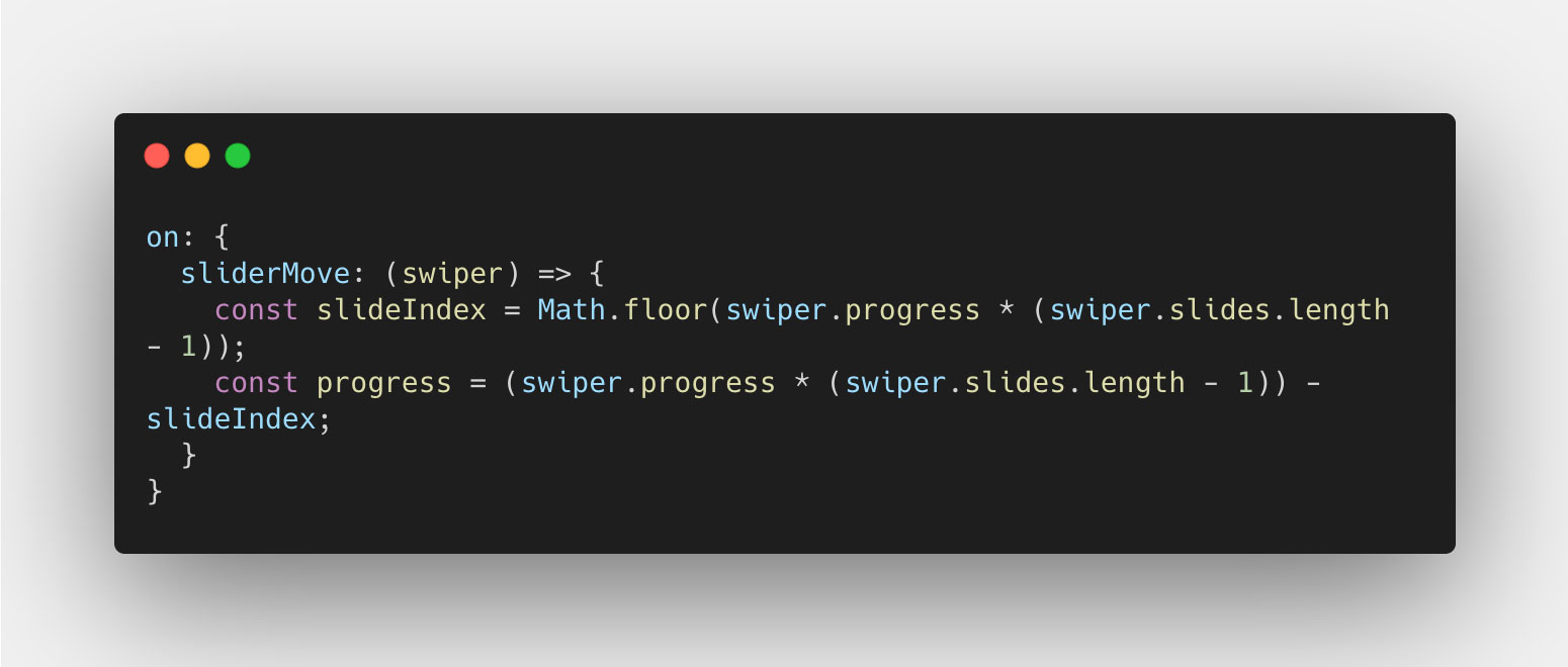
First of all, we want to determine the progress for each slide individually, to more easily calculate the opacity value for it, and we want to determine which slides we want to change the opacity value of. We'll do this by multiplying the progress value by the number of "steps" it has to take, which is always the number of slides minus 1. The result is that for each step you move on the slider, the progress value increases by 1 (100%). We can then take that same value, and round it down to determine the index of the slide that is moving out of view, and the same for the slide that is moving into view. This particular part in code can look like this:
Now that we have a progress value, and an index, we can start calculating the opacity value. We can start by determining that the index we want to target in the slides Array exists, using a typeof check like so:
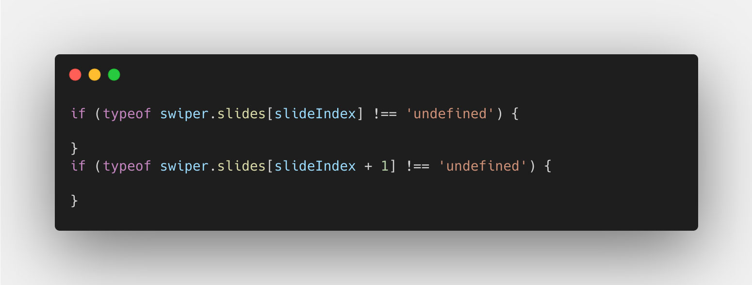
The first check is for the slide that is to the left, usually that one that was active on the start of the move. And the second check is for the slide to the right, usually the one being moved or transitioned to. These values will obviously change based on the progress value, so we don't have to bother about them, as long as we check that the index value exists in the slides Array.
Finally we'll calculate the opacity value for the two slides. The first one will be based on the value 1, and subtract the difference between 1 and the base opacity (0.3). Meaning the slide should lower the opacity by 1 - 0.3 = 0.7 to get to the base opacity 0.3 when the progress reaches a value of 1 (100%). In code, it will look like this:
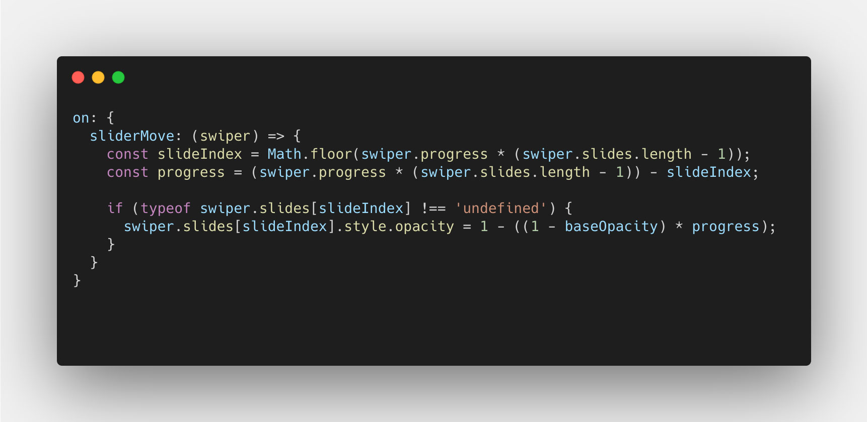
The same idea goes for the second slide, but instead the initial value is base opacity (0.3) and we add to the value, the difference between 1 and the base opacity (0.3) multiplied by the progress value. With that, our code now looks like this:
And we're done, good job! You now have a custom fade transition that works both with navigation and swipe using progress. 🎉
Centered layout with looping slides
We're now going to look at a different layout scenario, where the slides are centered in the view with a padding on the left and right, and the slides themselves loop. Meaning you can slide infinitely to both directions and move from start to end in the slider. This introduces a little more complexity, but nothing we can't manage. Here's a screenshot of the layout:
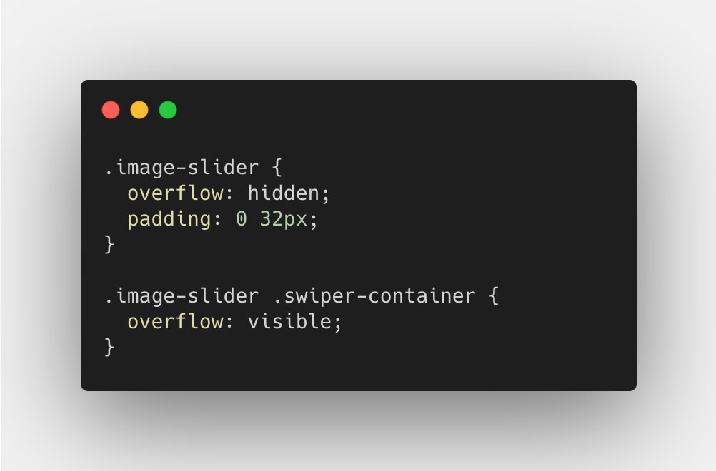
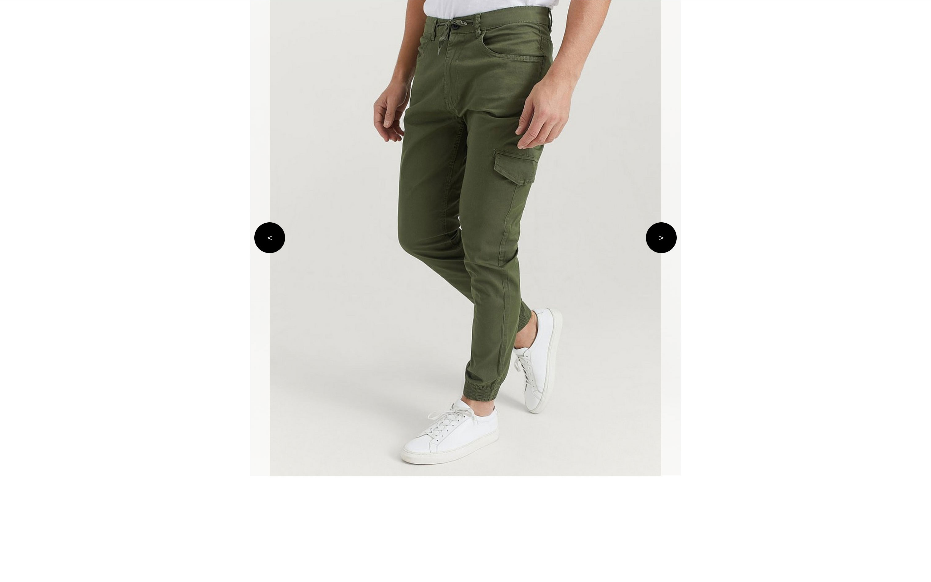 We'll get around this issue by removing the overlay: hidden; on the .swiper-container, and instead use it on the .image-slider element using some padding, like so:
Then we have to active the loop for the slider, using the property loop when we initialize the slider. Like so:
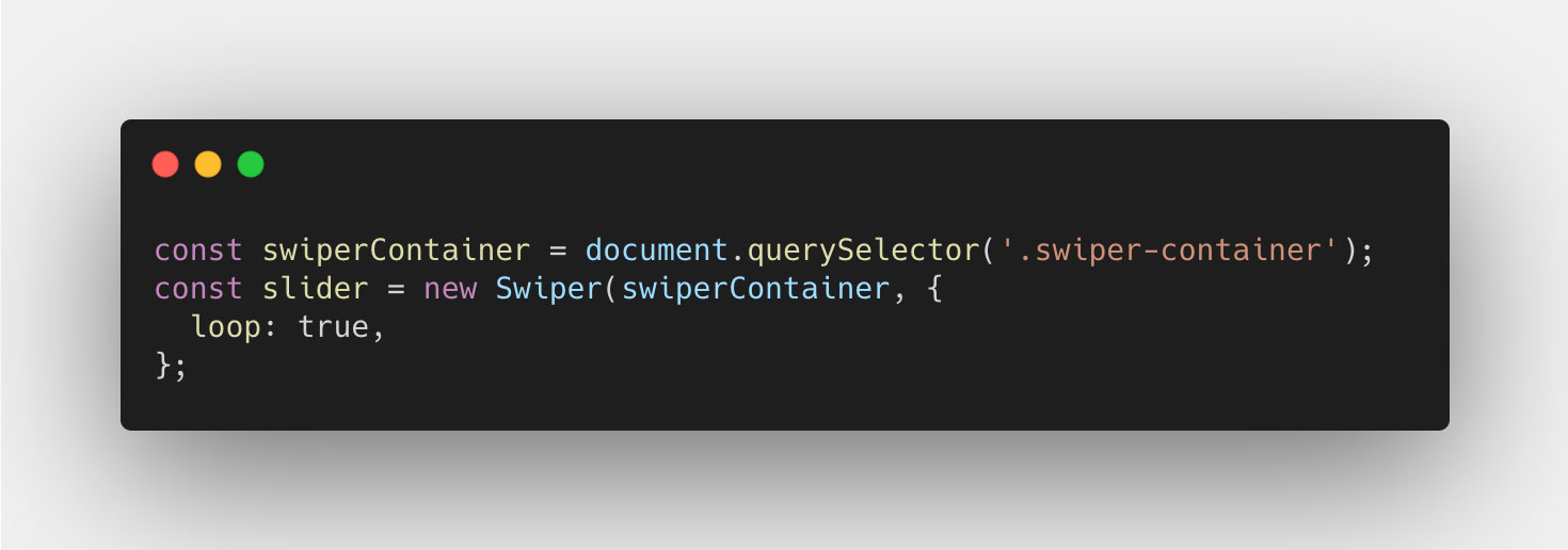
The only thing we have to change in our code for this to work though, is in the init event, where we target the index that should have the opacity value of 1. This should be changed depending on which version of Swiper you use (npm or CDN). I'm using the CDN version, specifically version 6.4.5, which adds 2 extra slides to the slider, one at the start and one at the end. However I know from experience that the npm version adds on 3x the amount of slides when using the loop feature. So you really have to handle that depending on what your version does.
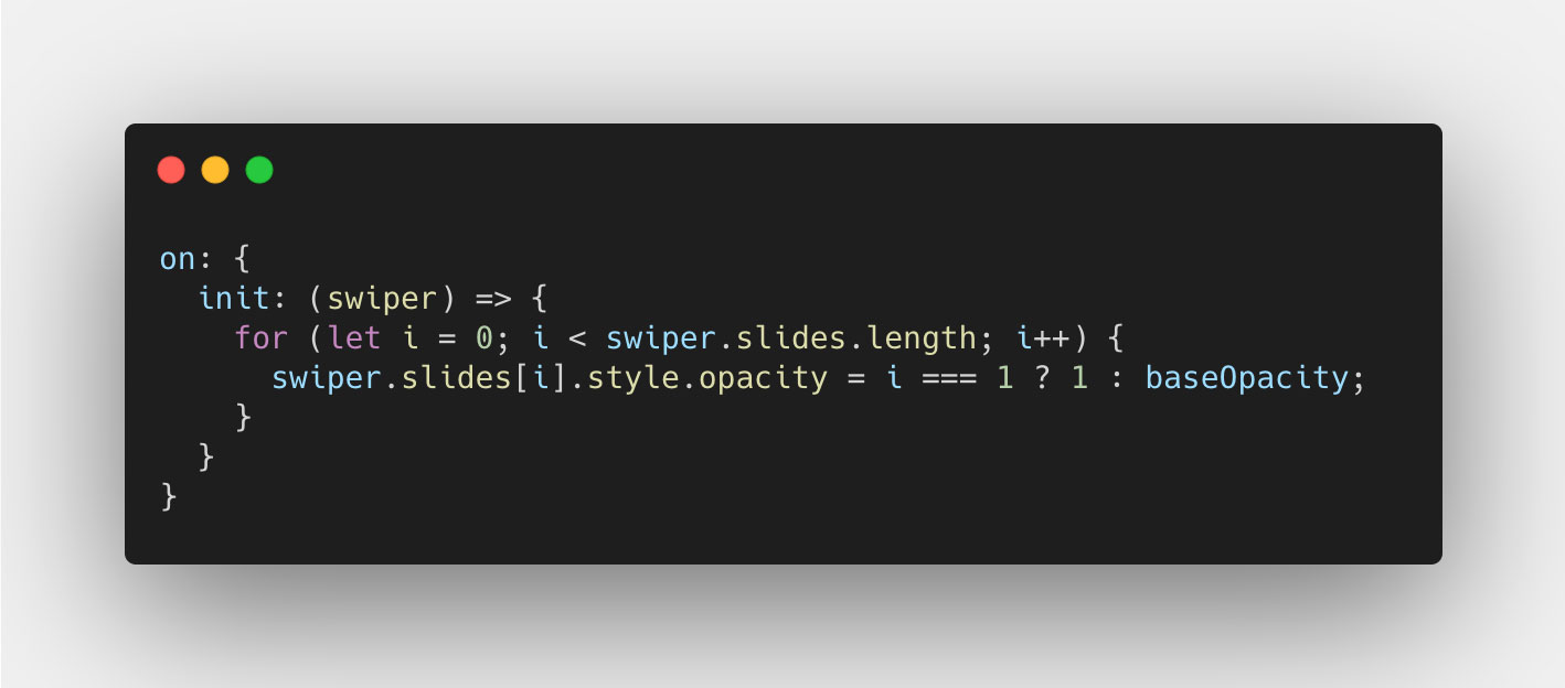
After that the rest of our code should just work, since it all relates to the slide amounts and we just depend on the Swiper instance taking care of the indexing and the progress value.
A more complex CSS layout
Finally, we've come to the complex version of this, which involves a more complex CSS layout (not really) where the slides take up 70% of the container width. You might think this doesn't affect much, but it sure does. And it requires some interesting math to solve, but let's jump right into it! Here's a screenshot of the layout:
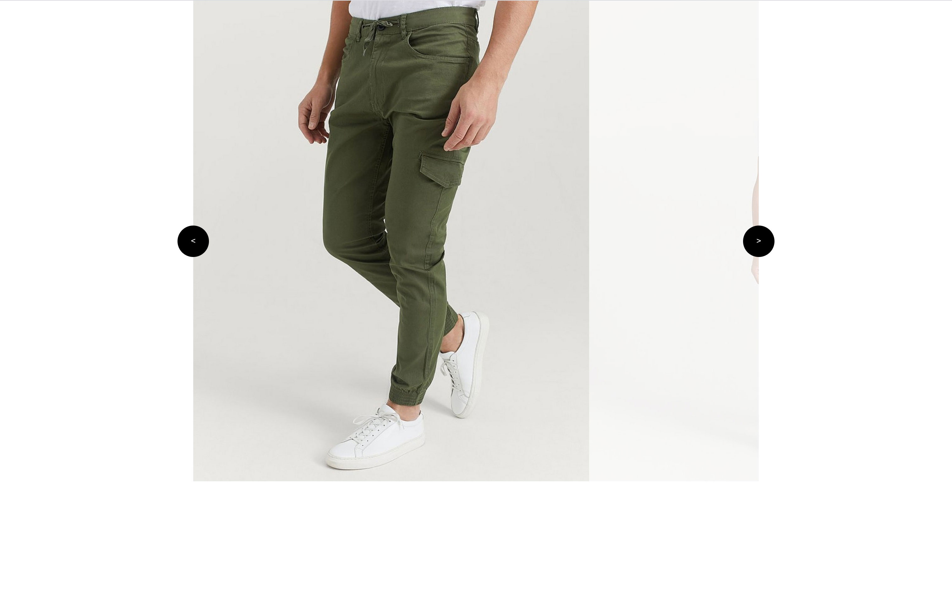
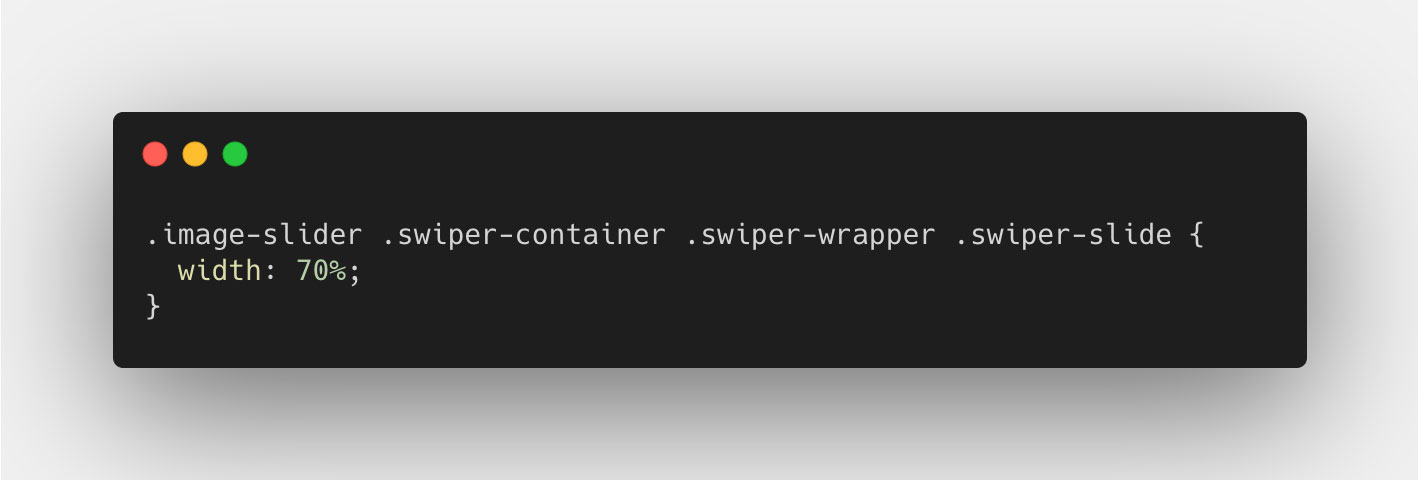
Let's start by changing the .swiper-slide CSS width:
And then set the slidesPerView to auto when we instantiate the slider:
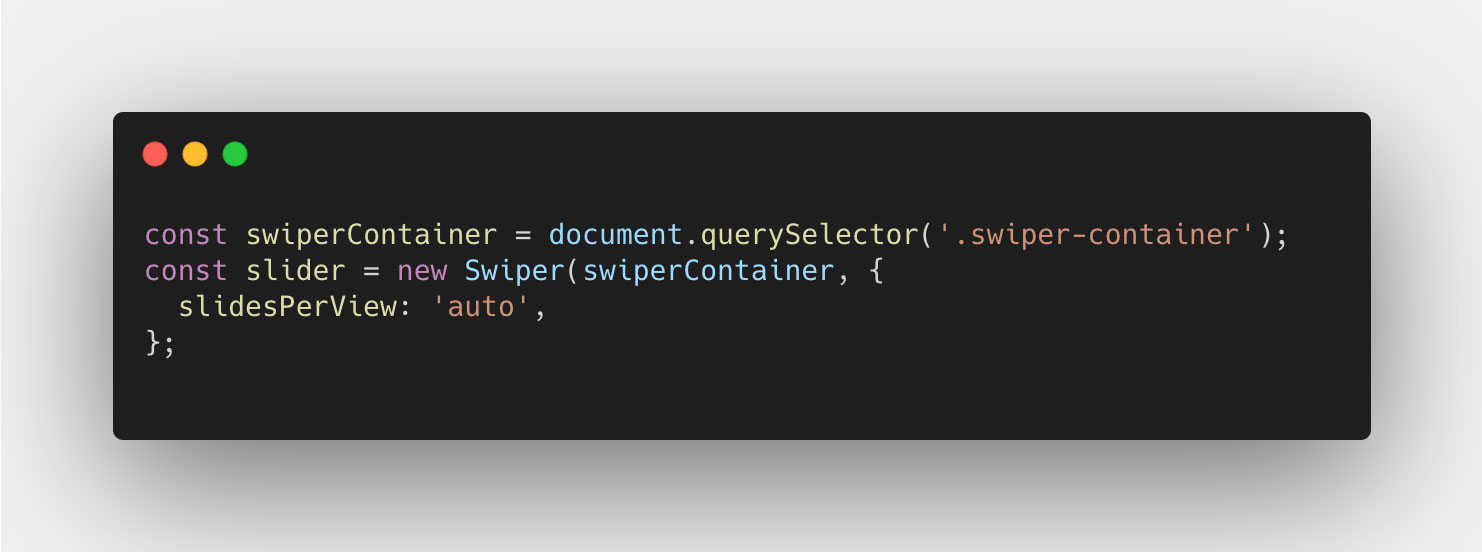
As you can see, the slide takes up 70% of the available space in the .swiper-container element. This introduces a complexity in understanding how the progress property works. See, the progress property returns a value based on the % the swiper has moved from start to end, calculated from the total distance the Swiper instance has to travel. When the slides take up 100% of the slider, that equates to the width of all slides subtracted by the width of 1, since that is the number of slides "outside" the container. But this is not the case in this instance. For our complex layout, we need to calculate the total travel distance in % for the wrapper, in order to better understand and use the progress property.
To do this, we base all our calculations on % value of the container, which will be defined as 100%. If we then look at the size of each slide, they are set to be 70%, meaning 70% of the container. If we add them up, we can see that the wrapper itself, inside the container, is 280% of the container's width, which includes the container of course.
This however is not the "scrollable distance", as this includes the actual container. But if we subtract the container, which is 100%, we get 180%, which is the total "scrollable distance" of our swiper. Here's a more visual presentation of this idea:
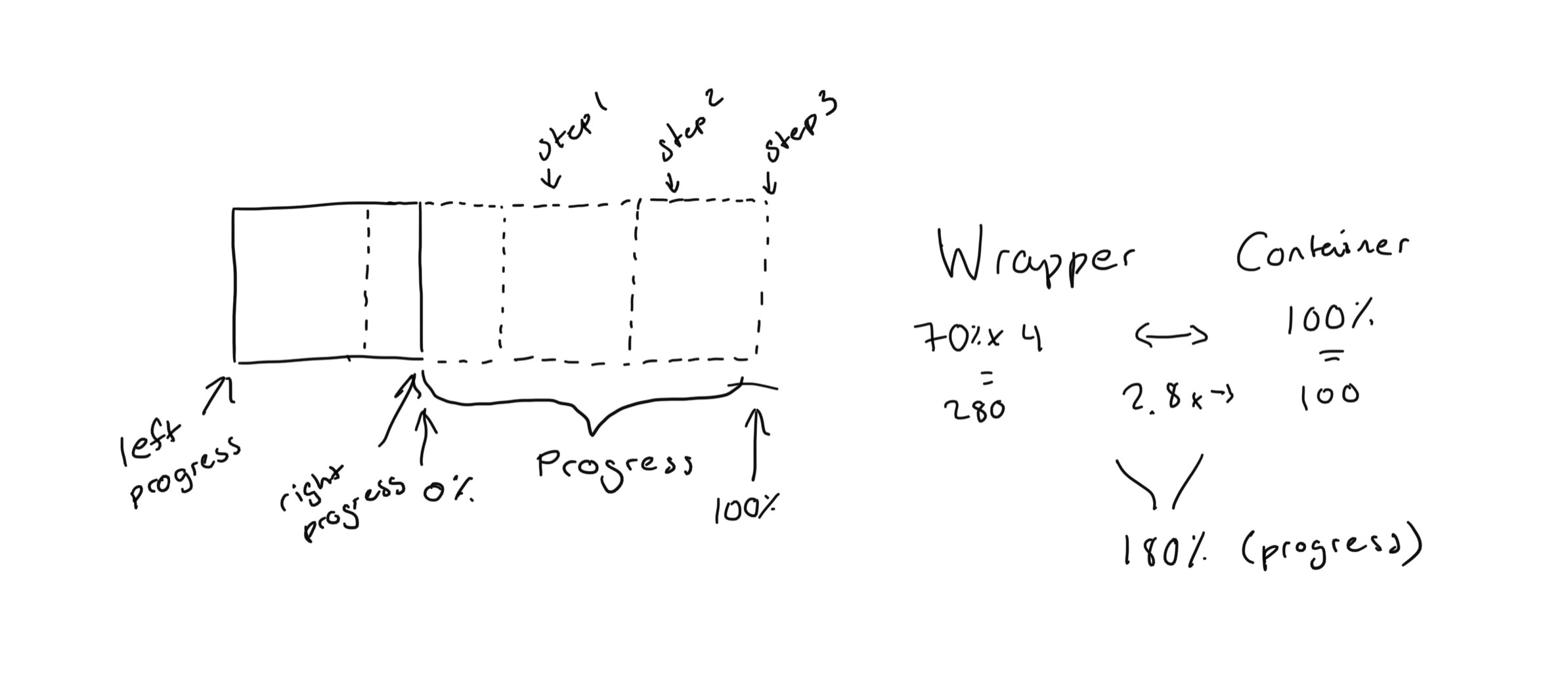
By using this approach, we always have something to refer to, if that is either the container width (100) or the scrollable distance (180). Of course, if we had a different width for the slides, or number of slides, this value would be different. But the same principle applies.
We also need to think about this a bit differently in the sense that, before we only had one edge to consider, that is the slides only moved in and out of either the right edge, or the left edge. Since the slides took up 100% of the width, we could only have 2 slides in the container at the same time, from either the right or the left. However since the slides now take up 70% of the width, we can have 3 slides in view at the same time. This means, we have to take into consideration the "progress" from each edge, the left and the right edge of the container.
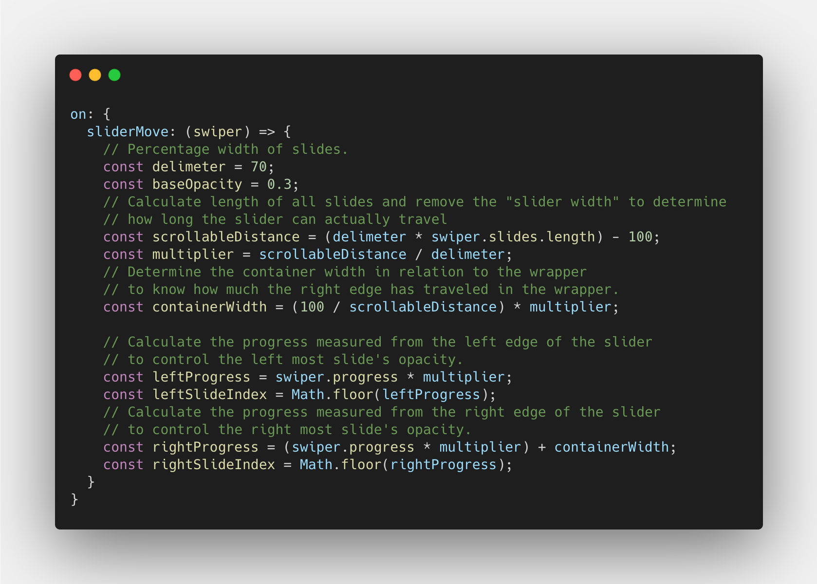
The left edge is quite straight forward since it is the basis of the regular progress property value. That is, every transition ends by a slide sticking to the left edge. The right edge, however, will be the same progress value with the addition of the container width. But that container width is no use in terms of it's base value (100%). Instead, we'll have to calculate how wide the container is in relation to the scrollable width, that is 100/180. With this value we can now move on the the progress property.
So let's look at the progress property value for the Swiper instance on the sliderMove event just like we did before. And since we know that the slides take up 70% each, and the scrollable width is 180%, each slide should have the value of 70/180 (≈ 0,38889) as progress from edge to edge. With this, we need to apply the same principle that we did before, which is to multiple the `progress` property by the number of slides subtracted by one. But in this case, the slides won't fit in an even number inside the scrollable distance, so we will instead calculate the number of slides that fit inside the total scrollable width. Here's the code for all that we just talked about:
Now that we have the progress value we need, we can look at actually calculating the opacity value for each slide, the left and the right. I am going to base the change of opacity on the progress reaching 50% for each slide. Meaning from 0 to 0.5, the opacity doesn't change, but from 0,5 to 1, the opacity goes from 1 to 0.3, and from 0.3 to 1 respectively. Let's start with the left slide:
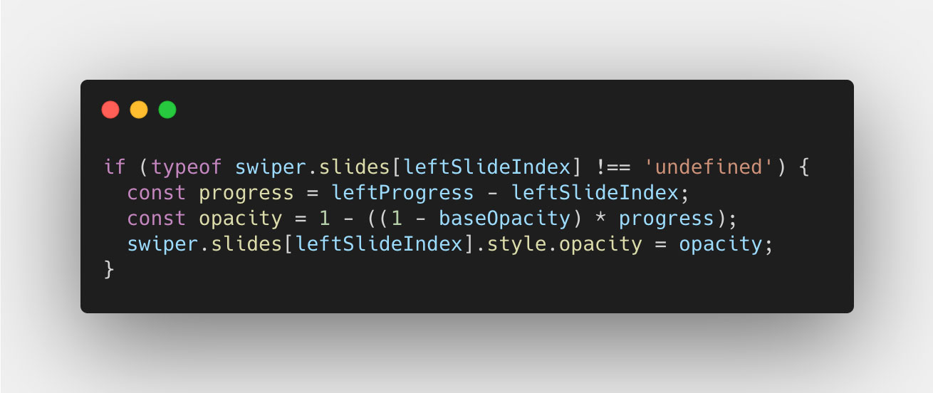
This is very similar to what we did before, so I don't think it needs more explanation than before. Now let's look at the right slide, this get's a little trickier:
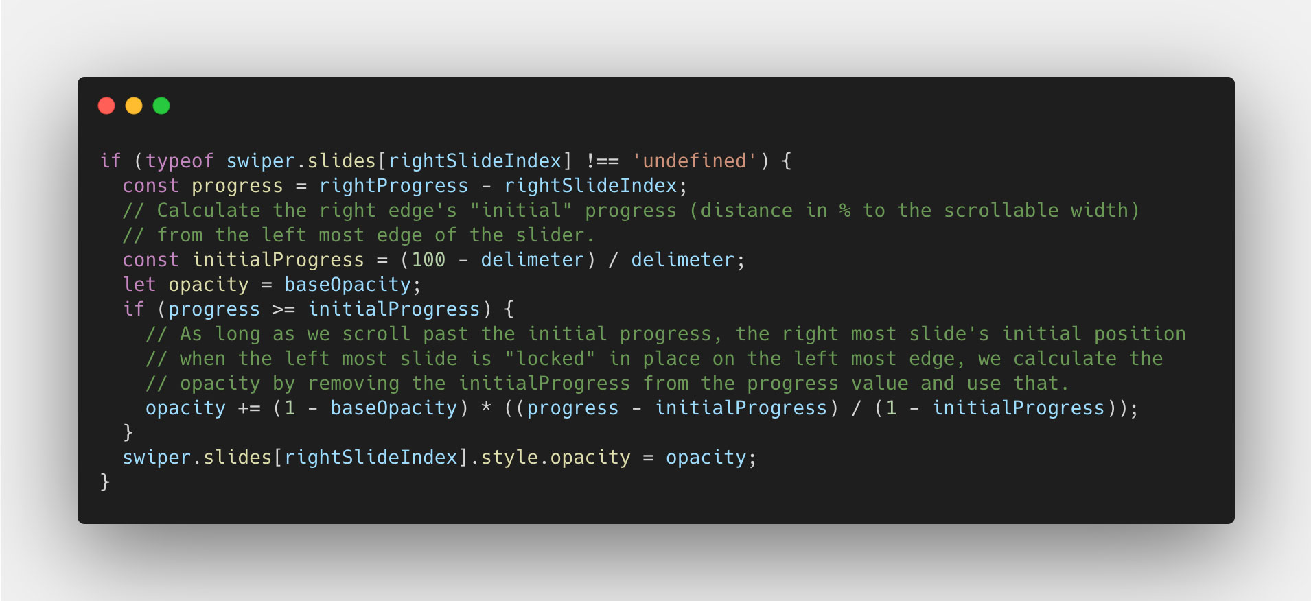
In this case, we have to calculate the "initial progress" by calulating the % of that initial width visible of the slide, to it's total width. So 30/70 in this case, which 0,4285714286. That way, we can ensure that we don't change the right slide's opacity, until we get past that "initial progress". And once we do, we subtract that "initial progress" value from the `progress` property value, and devide that by `1` subtracted by the "initial progress" value. Read that again if you have to, because it get's a bit too much at once. But anyway, we do this so that we don't have to care about the "initial progress" value, and only focus on the distance we've moved from the starting point, to the end. Hope that makes sense.
Now our code should look something like this:
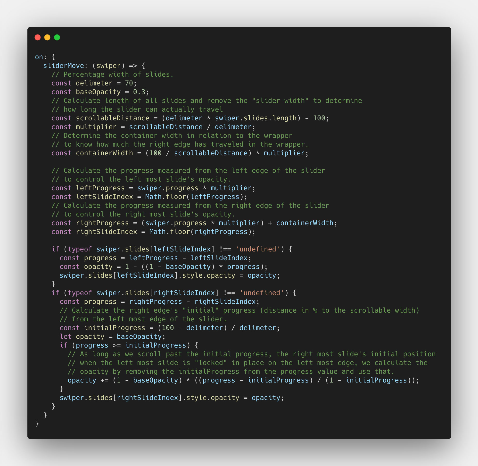
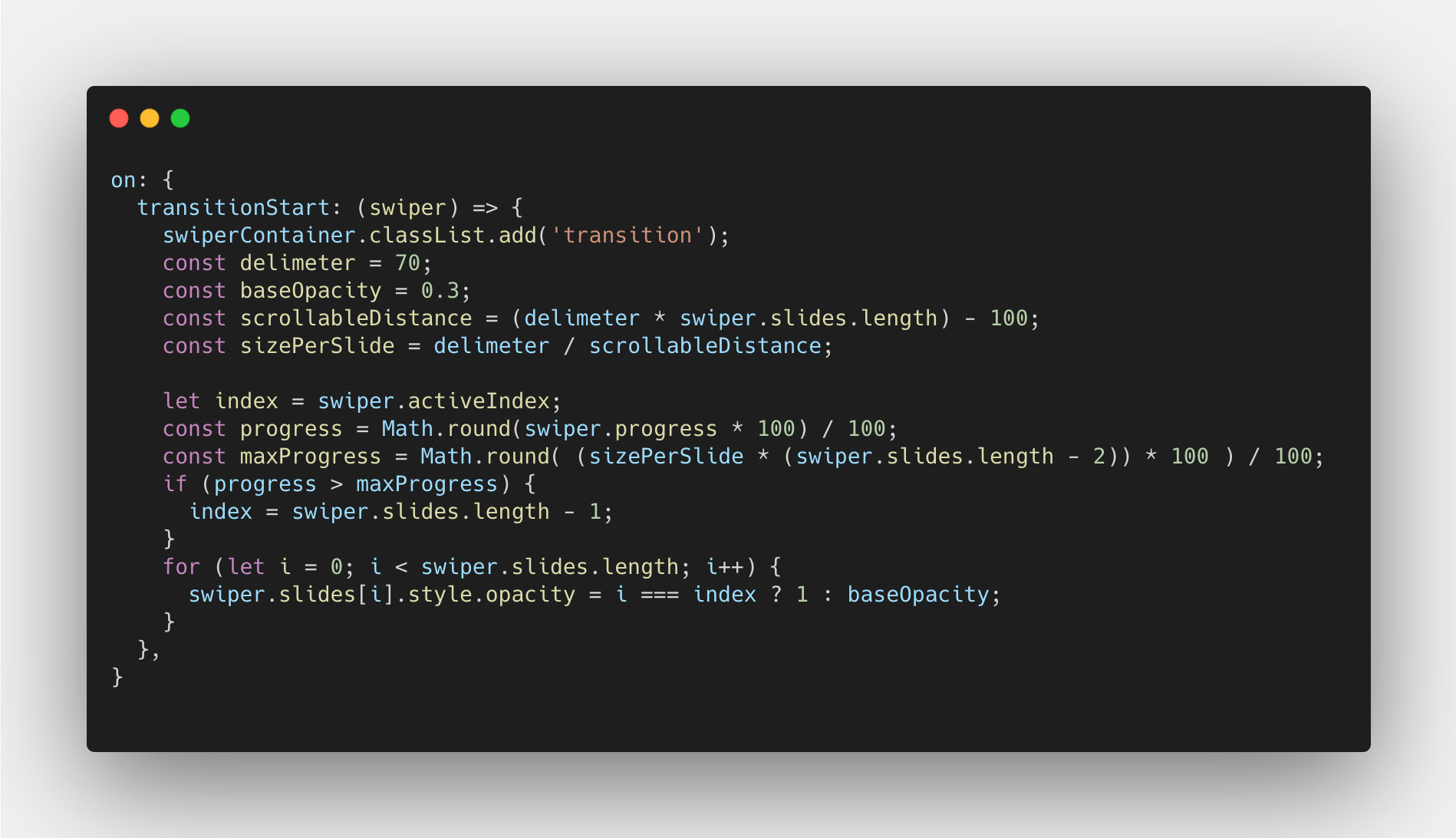
Now the opacity of the left slide should fade nicely pixel-by-pixel, and so should the right, as you move using the mouse or touch. All we have left then, is the transition part. We don't have to do so much work, since we've done all the heavy lifting in the sliderMove event. We can copy over the delimiter and the scrollableDistance variables, and use them to calculate the progress per slide. Like so:
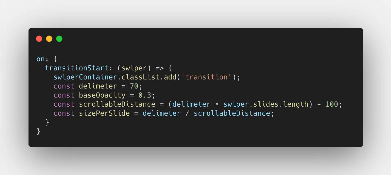
Why we do this, you will see shortly. Let's instead go ahead and add the code to set the opacity for each slide, like we did before, and we do this by using the activeSlide property, just like before:
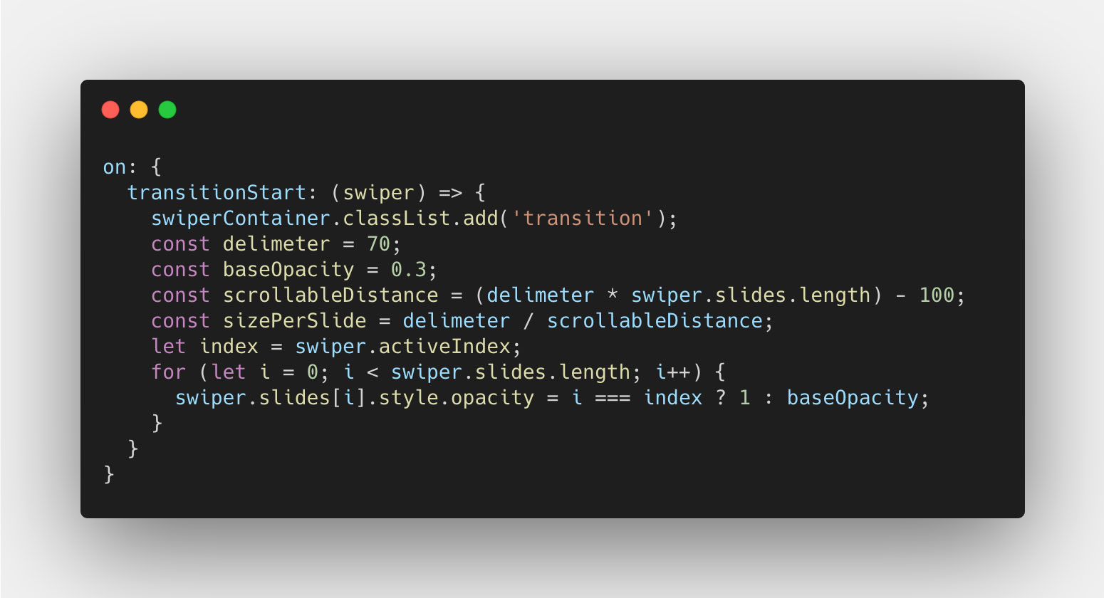
This will make the transitioning work just like before. However (!!), you will now notice that when we reach the end of the slider, the last slide does not change opacity. This is becuase Swiper can't determine the index it's on since it hasn't traveled enough and thus the progress is too low. But, we can work around this. Using the `sizePerSlide`, we can calculate the progress value when we hit the next last slide. And as long as the `progress` property value either is equal to or higher than that value, we can say that the last slide should have an opacity value of `1`. Like so:
